Everything Under Control: The New RocketFlag Dashboard
RocketFlag's new dashboard puts evaluations, flag health, team activity and traffic on one screen. Your whole organisation, one glance, everything under control.
Published on July 22, 2026
Most dashboards are a list of things you already knew, arranged in boxes. I’ve always thought a dashboard should answer exactly two questions: is everything ok, and what needs my attention? If it takes more than a glance to answer those, the dashboard isn’t doing its job.
When we shipped RocketFlag V2 I mentioned we’d ripped out the management UI and rebuilt it as the high-density “Control Room”. Today the centrepiece lands: a proper dashboard for your whole organisation. A Control Room needs a big board up the front, and this is it.
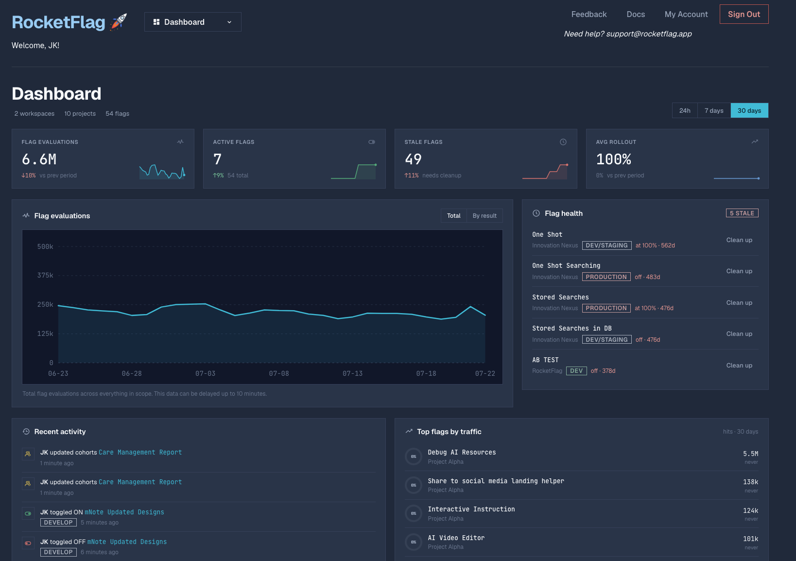
That’s my actual account in the screenshot, by the way. We’ll get to why that’s mildly embarrassing in a moment.
One glance, four numbers
Across the top: flag evaluations, active flags, stale flags, and average rollout, each with a trend against the previous period. Flick between 24 hours, 7 days and 30 days depending on whether you’re debugging something right now or looking at the longer trend. The scope line above it (workspaces, projects, flags) means you’re seeing your whole organisation at once, not one project at a time. No more clicking through ten projects to work out where the traffic went.
Below that sits the evaluations chart. Total by default, or split by result if you want to see how a rollout is actually landing with users rather than how you hoped it would. The data can be delayed up to ten minutes, and the chart says so right on the label rather than letting you assume it’s real-time.
The uncomfortable panel
Now, about my account. See that stale flags tile? Forty-nine. The flag health panel next to the chart goes further and names names: a flag called One Shot has been pinned at 100% for 562 days. That is not a rollout, that’s a permanent resident with its own mail delivery.
This panel is the Flag Caretaker putting its findings where you can’t ignore them. Each stale flag gets a Clean up action that hands you a tailored prompt for your AI coding agent to strip the dead branches out of your codebase. Dogfooding this feature has been humbling (the horror!), but that’s rather the point. If the dashboard only ever showed you flattering numbers, you’d stop looking at it.
Who did what, and what’s actually being used
The bottom half is context. Recent activity shows your team’s changes as they happen: who toggled what, in which environment, how long ago. When production behaves oddly at 4pm, “JK toggled OFF mNote Updated Designs in DEVELOP, 6 minutes ago” is the kind of line that saves you a Slack archaeology session.
Next to it, top flags by traffic. This one surprised me: one debug flag quietly serving 5.5 million evaluations while flags I thought mattered barely registered. Clearly I didn’t know my own traffic as well as I reckoned.
Why this needed the organisation
None of this works at the single-project level, which is why the dashboard is built on V2’s organisation-first model. Your projects and people live in one container, so the dashboard can aggregate evaluations, health and activity across all of it, with one flat bill and no per-seat maths. If you haven’t moved your projects into an organisation yet, it’s one click, and there’s a guide here if you get stuck.
The new dashboard is live now for all organisations. Log in, have a look, and if your stale flag count makes you wince, welcome to the club. The Caretaker and I are working through mine. That’s the whole idea, really: you can’t control what you can’t see. Now that it’s all on the board, I can get on with the controlling part.
As always, I’d love to hear what you think. Contact us, email, or find me on the socials. And if your dashboard shows a flag older than mine (562 days is the number to beat), I genuinely want to hear about it.