Carbon, Graphite & Brushed Silver: A Quieter RocketFlag
RocketFlag's console and website now share a quieter Carbon, Graphite & Brushed Silver design: colour reserved for live state and warnings, an aligned multi-environment pipeline, and a single-drawer flag editor.
Published on October 14, 2026
When you open a feature flag console, you are usually trying to answer a simple question quickly: what is turned on, for whom, and in which environment?
As RocketFlag grew over the past few releases (multi-environment group flags, per-environment cohorts, the Flag Caretaker, and Audiences and API tokens in 2.9), each row in a project had a lot more to tell you. And our original dark theme, which gave every environment and every badge its own bright colour, started working against you.
Over the past week we rolled out a redesigned interface across the RocketFlag console, and today the same design system lands on the website you’re reading right now. Internally we call it Carbon, Graphite & Brushed Silver. Here’s what changed and why.
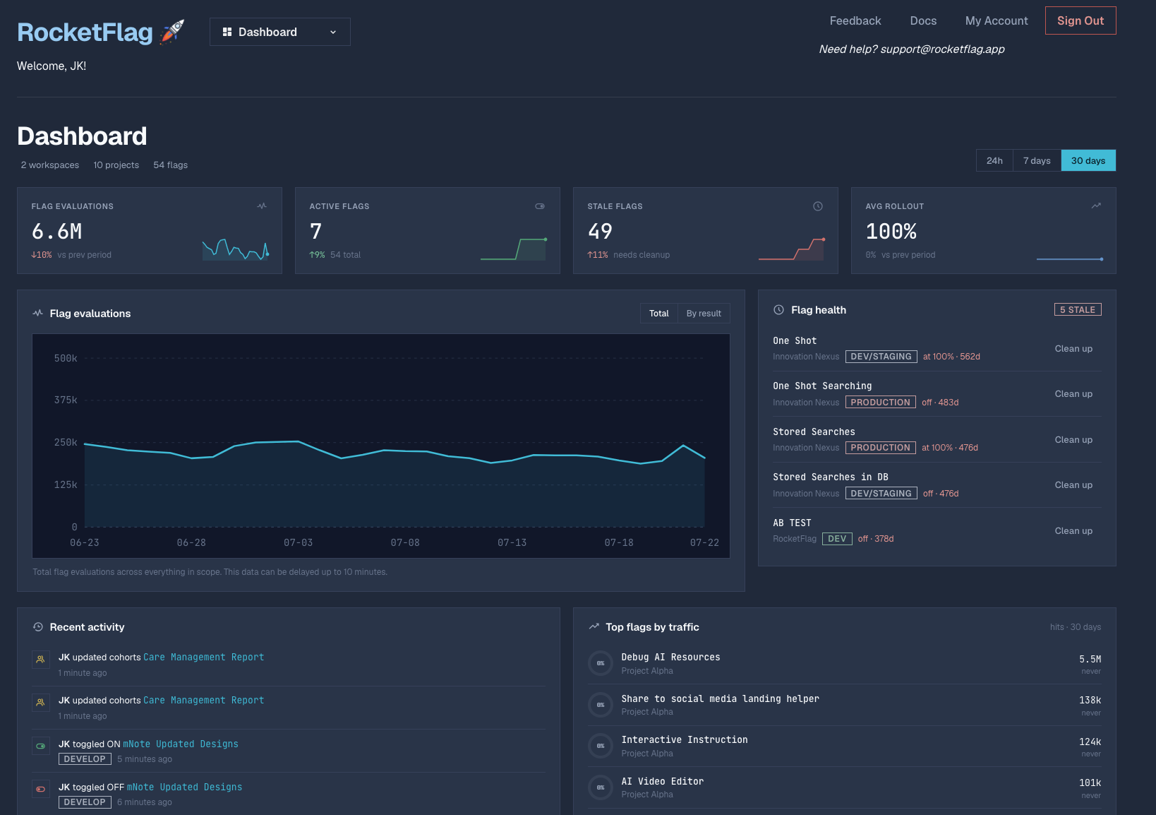
When everything is highlighted, nothing is
The problem with our old palette wasn’t how it looked on a two-flag demo project; it was what happened on a real organisation project with four or five environments.
In the old theme, prod got a red badge because production is important. An OFF flag also got a red badge because off means stopped. And the delete button was red because deleting is dangerous. Look at a table row with three environments switched off and your eye saw a wall of red, even though nothing was broken and nothing needed your attention.
Meanwhile, staging was yellow, cohort badges were yellow, and stale warnings were orange. Every badge on the screen was competing at full saturation, which meant you couldn’t scan a table at a glance; you had to stop and read every label.
In the new design, 95% of the interface is dark carbon, graphite, and brushed silver, separated by crisp hairline borders and square corners rather than heavy fills. Colour is reserved strictly for when it means something:
| Colour | What it means in RocketFlag |
|---|---|
| Muted Sage | A flag or environment is actively evaluating ON. |
| Recessed Carbon | A flag or environment is OFF. Off isn’t an error; it’s just off. |
| Muted Amber | Something needs attention or denotes scope: Caretaker alerts, stale flags, cohort overrides, production confirmations, and the Teams tier. |
| Muted Steel Blue | Navigation, focus rings, evaluation charts, and the Flag half of our wordmark. |
Removing red from OFF badges and removing rainbow colours from environment names makes the biggest difference day to day. You can look at a project with four environments across twenty flags and see what is actually live in half a second, because the only green on the screen is what’s turned on.
Primary actions follow the same restraint: a single Brushed Platinum button for the main action on any view ("+ New Group Flag", “Save Changes”), while secondary controls sit quietly in bordered graphite until you reach for them.
One pipeline row per environment
While we had the console open, we fixed the layout issues that had crept into the group flags table as more targeting features arrived.
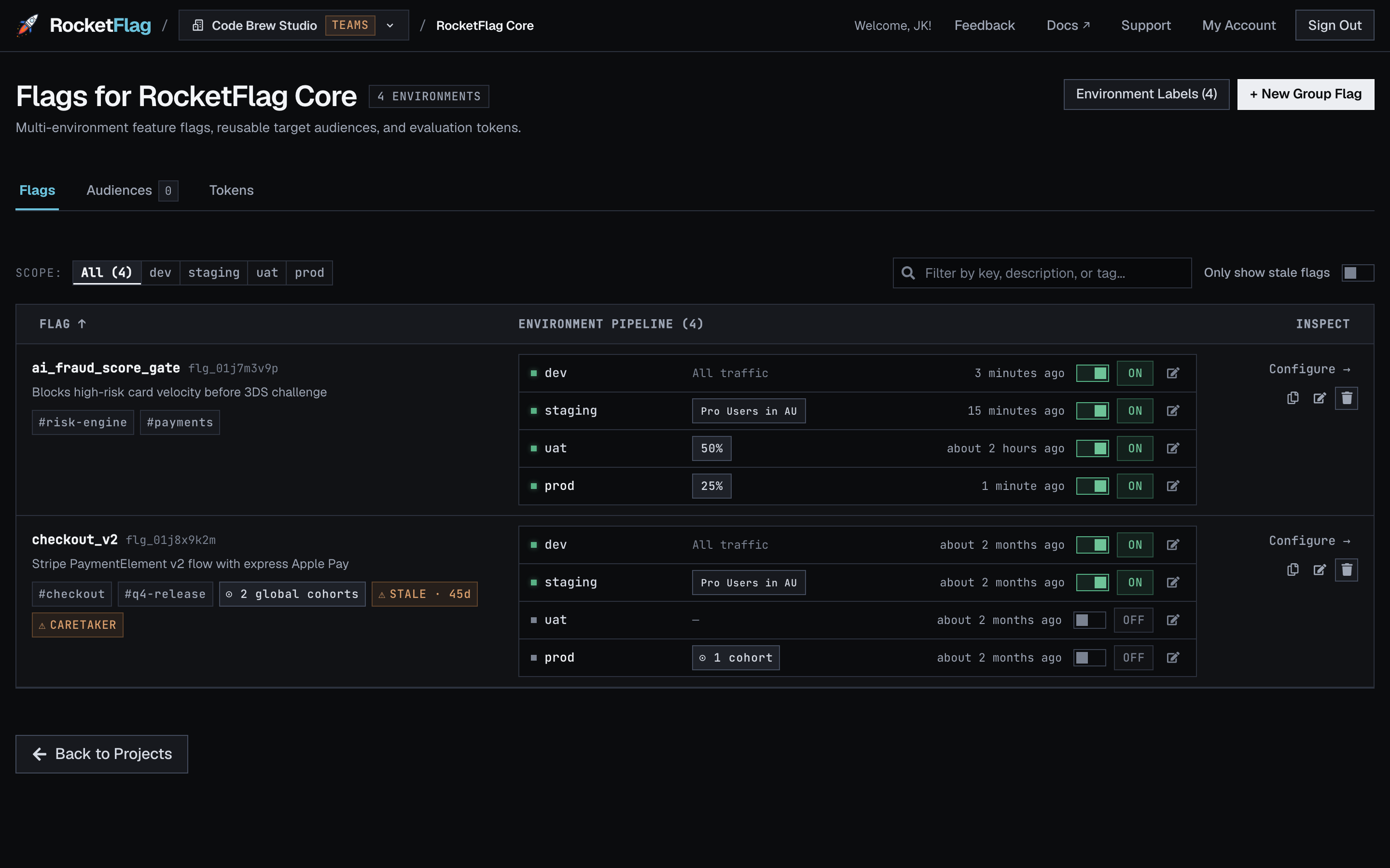
Previously, the group flags table split Environments, Traffic, and Last Hit across three separate columns. That worked fine when every row was one line tall. The moment an environment name or an audience badge wrapped onto a second line, the three columns drifted out of vertical alignment, and you were left tracing across the screen with your finger to work out whether uat or prod was the one sitting at 25%.
Now, the environment pipeline is a single aligned column where each environment renders as its own horizontal row:
- Environment name (
dev,staging,uat,prod), with a sage indicator dot when live. - Targeting rules in the middle: cohort overrides, attached audience, and rollout percentage (“All traffic” at 100%, or a 25% chip when splitting traffic, replacing the old circular progress rings).
- Last evaluated time and the toggle switch on the right.
Above the table sits a new Environment Scope Bar (dev, staging, uat, prod). Click prod and the whole table filters down to production rows only, sorted by production state, so you can check what’s live in production without reading past development and test environments on every flag.
A few smaller quality-of-life improvements landed in the table at the same time:
- Plain relative timestamps. The
🔥and🧊emojis in the Last Hit column have been replaced with readable relative times (“1 minute ago”, “about 2 months ago”) that show the full date and time on hover. - Instant toggles. Flipping a flag now updates in place without a full-screen overlay interrupting your flow, while keeping the confirmation prompt whenever you toggle a flag in production.
- Brighter muted text. We lifted our minimum font size and raised the contrast floor on secondary text so flag IDs, timestamps, and badge labels are easy to read at a glance.
Everything for a flag in one drawer
Until last week, configuring a multi-environment flag meant jumping between three separate dialogs: one to edit the flag’s name, one to manage its environments, and a third per-environment modal if you wanted to set per-environment cohorts.
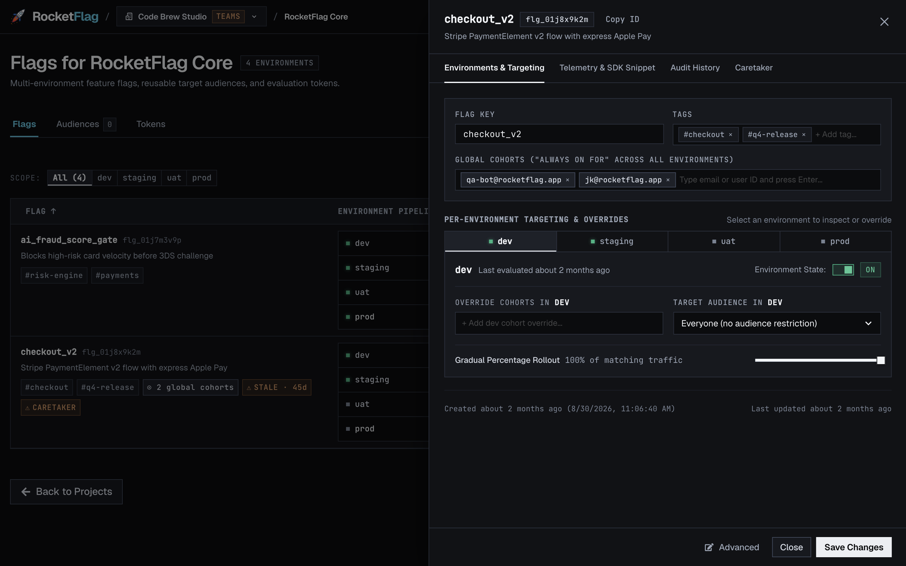
Clicking any flag now opens a unified inspector drawer where global cohorts, tags, and per-environment targeting (cohort overrides, target audience, and the rollout slider) live together. You can step through dev, staging, uat, and prod on the tab bar inside the drawer without closing it and losing your place in the project.
The website matches the console
The final step was bringing rocketflag.app onto the same system.
Until today, clicking from the marketing site into console.rocketflag.app felt like stepping between two different products. The website has now been rebuilt around the same Carbon, Graphite & Brushed Silver palette, the same Mona Sans and JetBrains Mono typography, and the same tier badges across both the pricing page and the console’s billing screen. We also updated the feature-flag bill calculator and vendor comparison pages to match.
Go have a look
If you’re already on RocketFlag, open the console and try the new Environment Scope Bar and inspector drawer on one of your projects. If you’re new here, the Solo tier is free without a credit card, and Teams is a flat $79/month for your whole organisation with unlimited seats and unlimited evaluations.
As always, if you spot something we missed or have thoughts on the new design, I’d love to hear from you. Contact us or find me on the socials.